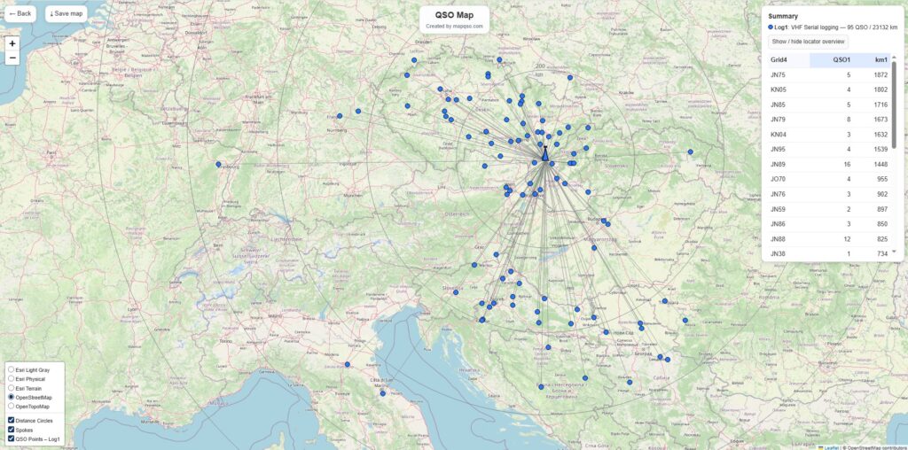
For radio amateurs who work with QSO records, represents QSO Map from OK1NOR an exceptional tool - a simple yet effective way to visualize truly diverse connections in the form of an interactive map. The goal is to convert EDI logs into a clear map format and help users better understand the geographical distribution of their connections.
In the article you will read
Main features of QSO Map
- Support for one or two logs - You can upload one or two EDI files and compare connections between them.
- Color schemes and icon styles - The user chooses a color for other stations and their own station ("My QTH"), size and type of icon (solid dot, with "stone", pin, cross with dot).
- Distance circles - Suitable for marking circles at selected distances (e.g. 10 km, 100 km, 500 km). You can choose the number of circles and their appearance.
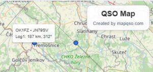
- Interactivity - By clicking on any QSO icon, connection details are displayed (e.g. call sign, grid, time, etc.).
- Intersection search - If there are the same connections in two logs (same call sign + grid), they can be displayed with a special color or icon.
- Saving the map - You define the name of the map, which will also be used as the default name when saving the resulting image.

Technical references and background
QSO Map expects valid 6-character Maidenhead locators in EDI logs (e.g. JO80AB). Duplicates (same call sign + grid) will be merged - the resulting map will remain clear.
The entire tool is designed to generate the map in just a few seconds even with extensive logs. It is the work of the author Jindru OK1NOR (Jindřich Košťál).

Who is it useful for
For radio amateurs who want:
- display the geographic distribution of their connections,
- compare the results of two different logs (e.g. different contests or periods),
- visualize intersections between logs,
- easily share or save connection maps.
QSO Map combines ease of use with strong visualization - an excellent tool for those looking for a practical way to process and display their QSO records.
